Losing products to button syndrome
My dad passed a few months ago, and as it often does my subconscious keeps serving up memories of us at seemingly random moments. One of them led me down a train of thought that connected quite deep into the work we do at Greywing, and where we're going.
As a kid, one of my favorite things to do with my dad was to be his assistant. He was an engineer who spent his time repairing, building and putting things together to shape his universe. I loved that he could change his world because he wanted to, and as a four-year-old the best thing I could do was to help.
Years later, we would have a conversation about assistance, and about how it's often harder than doing the thing itself. He ran an R&D lab, training students and mentoring quite a few engineers. I remember him telling me that there were two eventual settling points for helping someone.
One of them was to understand everything that was needed - all the tools, the accoutrements, the crimped wires - and to prepare them in reach of the person performing the action. This was a sort of mise en place (or mise en scene) that took a higher startup cost, but left the helper free to relax or let his mind wander, having set the scene for the work to happen.
The other, he mentioned - is what separated good assistants from great assistants - and it's what he tried to do when it was his turn. Here, you do as much preparatory work as you can, but the process is a mentally active task of performing the action in your mind along with the person actually doing it. You anticipate each need and offer the right tools - or the associated preparatory work - at the right moment. The right tools and assistance, at the right time - nothing else.
Now, here is Greywing as it looks today:
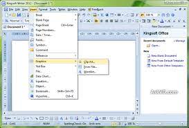
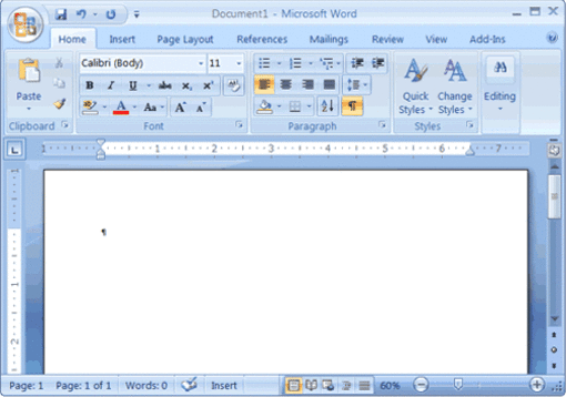
A lot of functionality - and each one came directly from an important (and often mission-critical) use-case. Very useful - if you know where everything is. It isn't just us, here's Office 2003.
Here it is after the rebuild.
To understand why our interfaces monotonically increase in complexity, the history of software is helpful.
§How we got here
Modern digital systems have evolved from tools to assistants. The browser used to be a tool to view markup and visit hyperlinks. Note-taking software used to be a tool that could capture keystrokes and paint them on a screen. Today we have entire operating systems with internal task management, typeahead boxes and cloud syncs with instant pagesetting.
This has changed the paradigm we operate under, as architects of this software. It is no longer enough for us to surface functionality to the user, and remind them where that functionality lies. A shared language of interfaces has surfaced that we can use to understand what the user needs, and present them this - nothing else.
This shared language is rather simple - and it does vary somewhat between platforms and modalities - but it's powerful in understanding intent, and in communicating it from the realm of the human to that of the machine. Much like my dad extending a hand backwards meant that he needed a tool I hadn't yet provided, we can make learned assumptions from user behavior.
A hover is often a request for more information connected to the pointer, understood to be ephemeral in existence. A click is a more permanent investigation into something, a transition of state whose exit needs to be intentional. Esc is a request to remove anything that can be removed, a transition to a starting point - the same function of a home button.
Yet our interfaces often cram functionality into valuable screen and mind-space, and we're left with this:
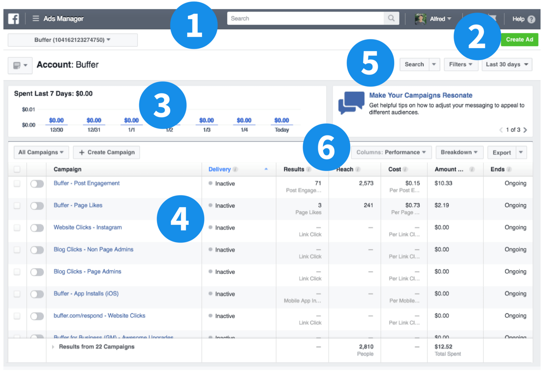
If you've ever used these interfaces, you'll know what I mean.
An example I used recently at a talk was jet fighters and how their cockpits have evolved over time. From World War II to 3rd-generation fighters, the increase in interface complexity is obvious and frightening. I took a lot of my information from this talk, which reminded me that some of us are somehow good at everything. Strongly recommend.
§Why does this happen?
The lazy answer is that it's easy - and this is partly true. The adage is that "a lazy engineer is an efficient engineer", but I've often found this not to be the case. Effort - often front-loaded and spent at the beginning - can save multiples over the long run. Anyone who has done a refactor before it was absolutely necessary can attest to this.
The biggest reason why is that no product or company comes into the world fully formed. All of them begin as an attempt to do something new, or do something old in a new way. They were all startups once, and all products were an empty box once. This means that they are all subject to the vicissitudes of creation. Creating something - often, for someone else - is a random walk as both they and you discover what this thing is that you would like to exist. Of course, once every generation we have wunderkinds that can build in secret the thing that will stand the test of time and be exactly what is needed, but ahead of the rest of us lies the work of iteration.
This to me is the primary reason. Intent cannot be well-defined before usage, and usage cannot happen before functionality. You can predict some with theory, but the only way to see if something can hold water is to fill it. This way, we put functionality in front of the user, like we buy things we're not sure we'll use and place them in our homes. We forget to clean them up later.
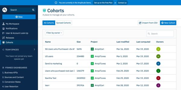
The second and final part of this problem is the human mind, and the shared-tenancy nature of software. If you live alone, you can recognize every year at spring when you have something you no longer use. You can then get rid of it or move it elsewhere. For a platform like Facebook Ads Manager, you merely share this house with millions. You can be sure that every single piece that impedes you in your life is essential to someone else, given enough users.
The only solution forward, then is to spend more time understanding intent before you change things. There is an innovation quota - even in software - of how much "new" your users are willing to tolerate. You'll know when you've hit it.

(Another often used method - that I avoid unless I absolutely cannot - is to throw away a portion of your users because they weren't statistically significant. Google, man.)
§What can we do?
Greywing is at the correct point in time - halfway to product-market fit, and with a product in the field for about a year - to encounter this problem. Question remains, what can we do about it?
One of the easiest and most overlooked ways to move forward is to learn from others. It's tempting to think - especially in a startup - of your problems as snowflakes, but experience for me has been repeatedly learning that very little "is new under the sun".
Let's consider jet fighters. This is a F-15:

This is an F-22 and an F-35:
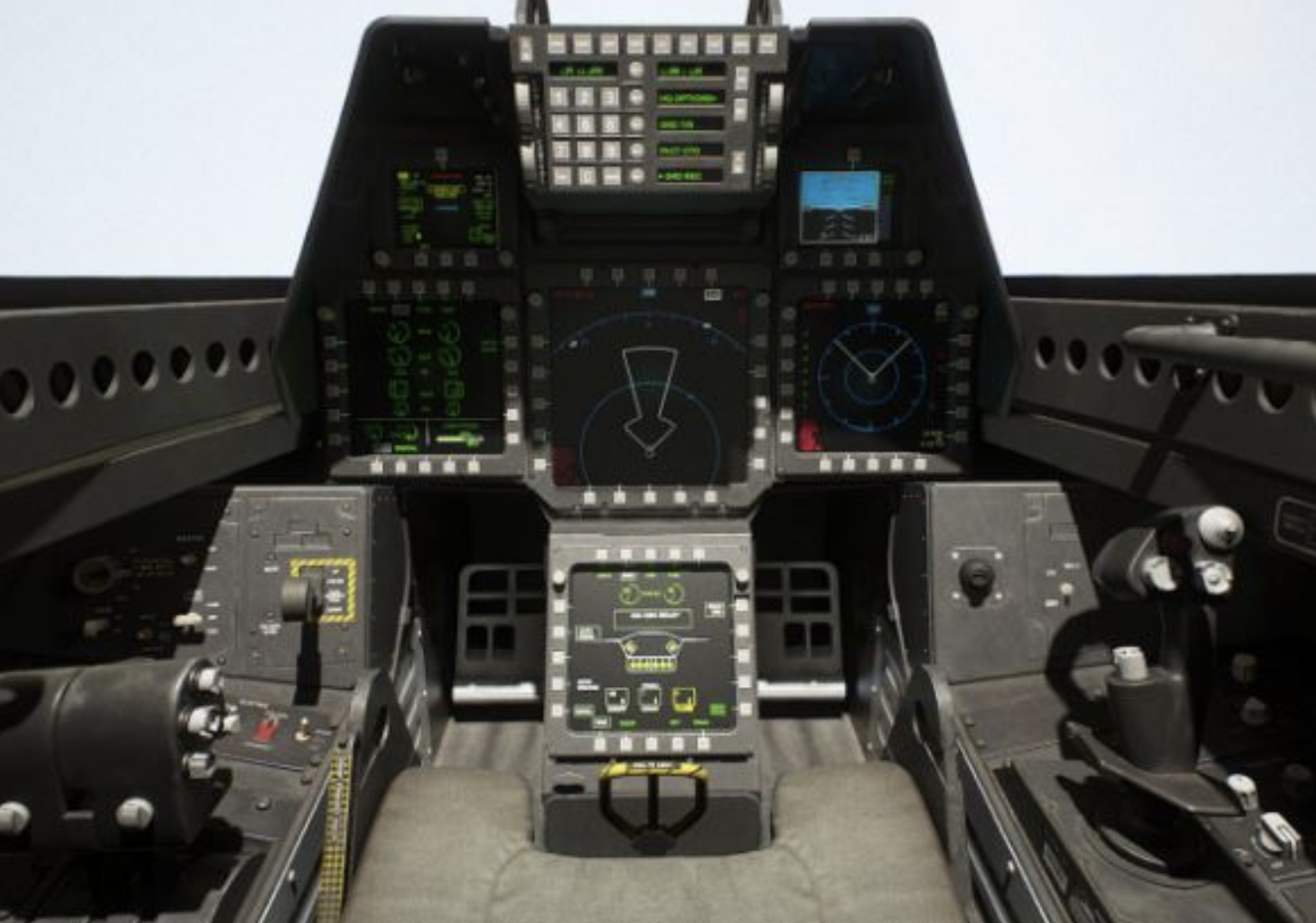
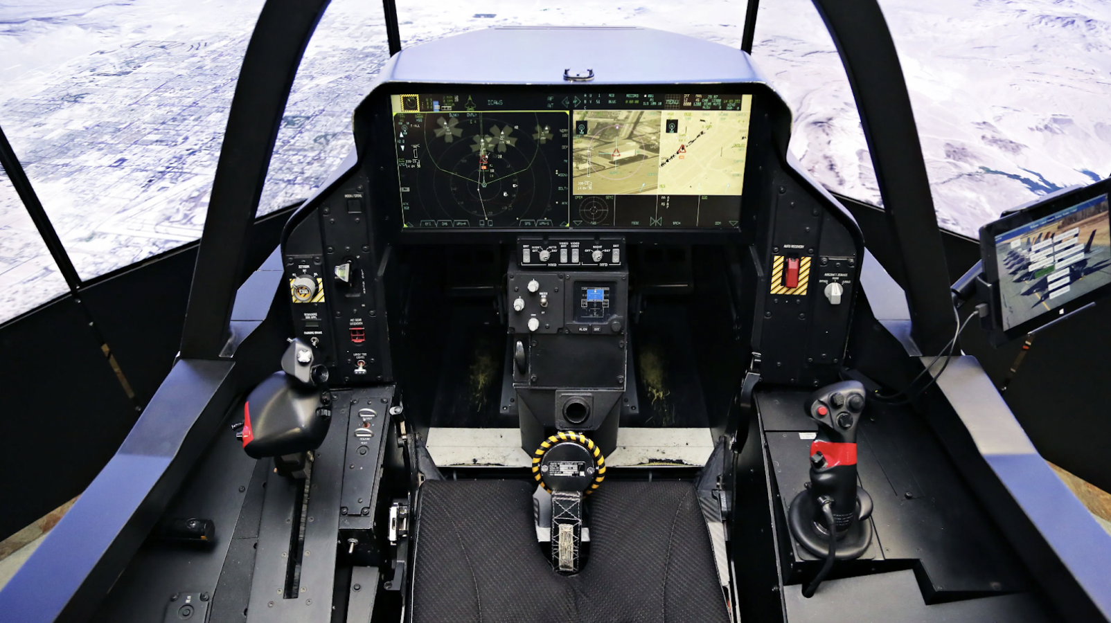
What can we learn? Before that, what do we observe?
First, Fitts' law finds strong application. Most actions to be performed are grouped by situation. Fuel controls are near the throttle, fire controls and indicators are closest to the hud and window where you look when fighting, and the stick is no longer in the middle, so you don't need to move your hands by almost a foot to get to a control.
Second, a large number of buttons are unlabeled or dynamically labeled, so they can adjust their function depending on context. Landing gear control is not needed when in a dogfight. The system - once it understands context and intent - can adjust itself to be simpler through exclusion.
This is not without problems, and you can sometimes see the reason old users prefer to stick to what they know. The following is a video of a crash caused by the flight computer presuming the wrong intent on behalf of the pilot and wrongly configuring sensitivity. The pilot survived with minor injuries, but I imagine a whole bunch of software was rebuilt.
§Our path forward
There are a number of ways we can move forward, but at Greywing our solution has been to move towards search-based interfaces. The world we operate has some curious distinctions. Our users aren't tech-natives, with some of them being much older than the average tech user. Our user numbers aren't B2C numbers, often far below the threshold where A/B-testing and behavioral cohorting can yield useful results. When building a simpler system, we need to make sure we use the simplest primitives to understand intent, and build in mechanisms that tell us when we're wrong.
Search to us feels like the best way to achieve this, and brings a few benefits:
- Search-based interfaces strike a good balance (when well implemented) between command-line levels of power user activity, and verbose descriptions of actions for new users.
- Suggestions can remove the initial confusion of "what do I do?" and suggest paths that can be modified once the user learns more.
- New functionality can be integrated and field-tested without adding to the control surface.
- Most importantly, failed searches tell you more about problems than most analytics. There isn't an analytics event for "couldn't find it".
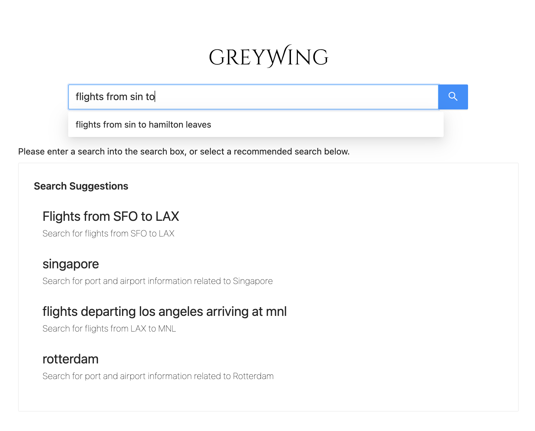
We're still working on these things, but here's where we are at.
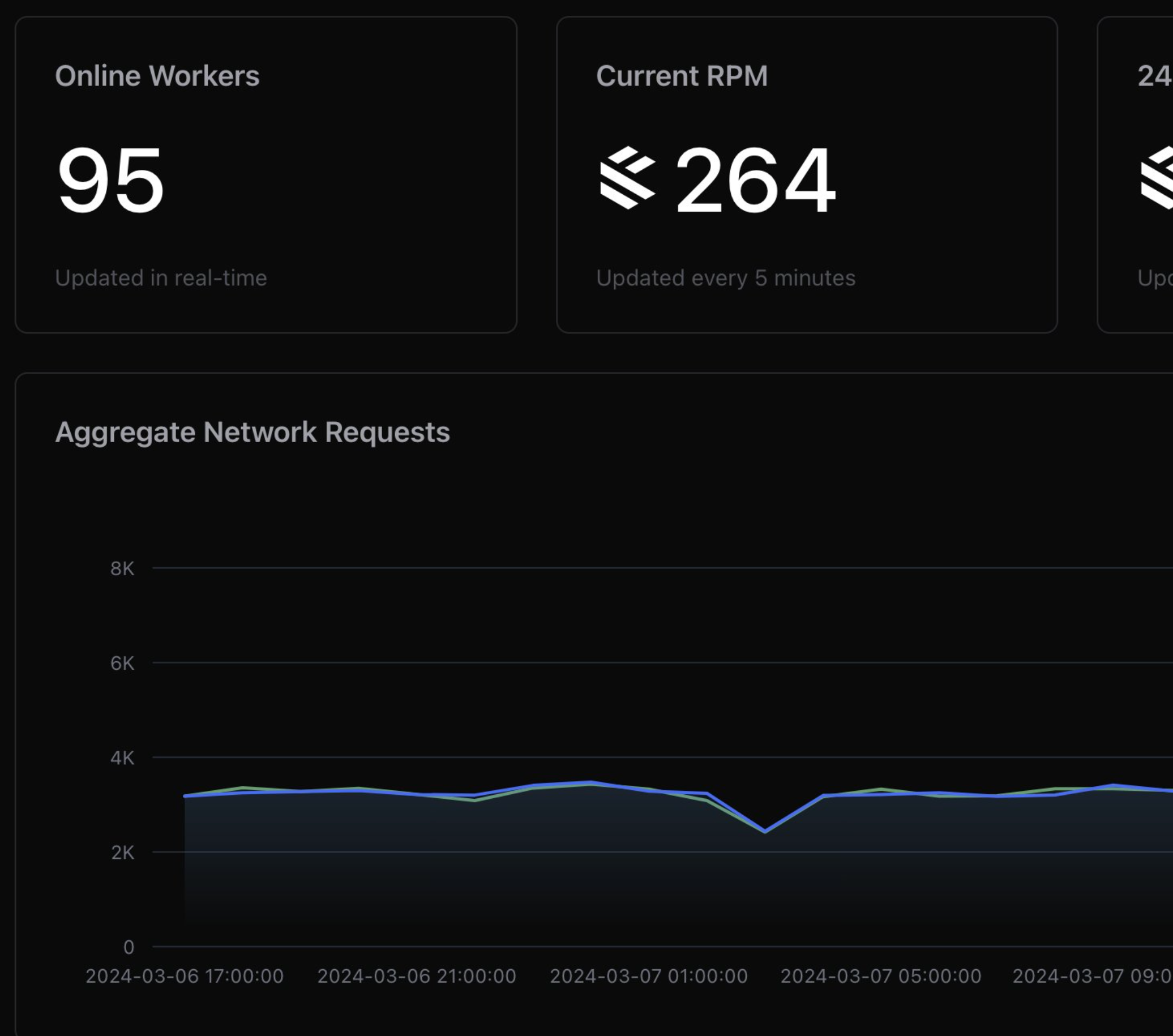
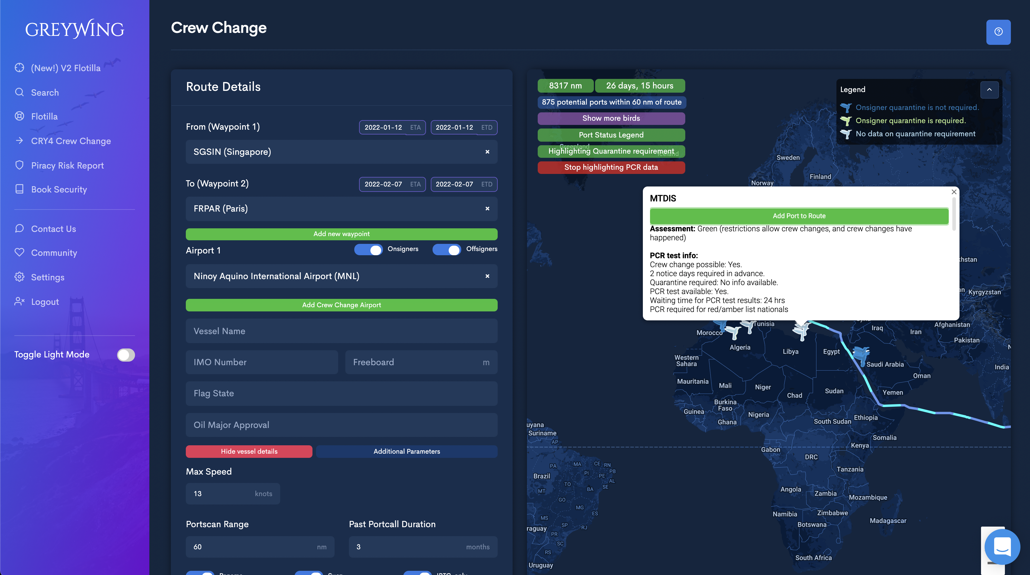
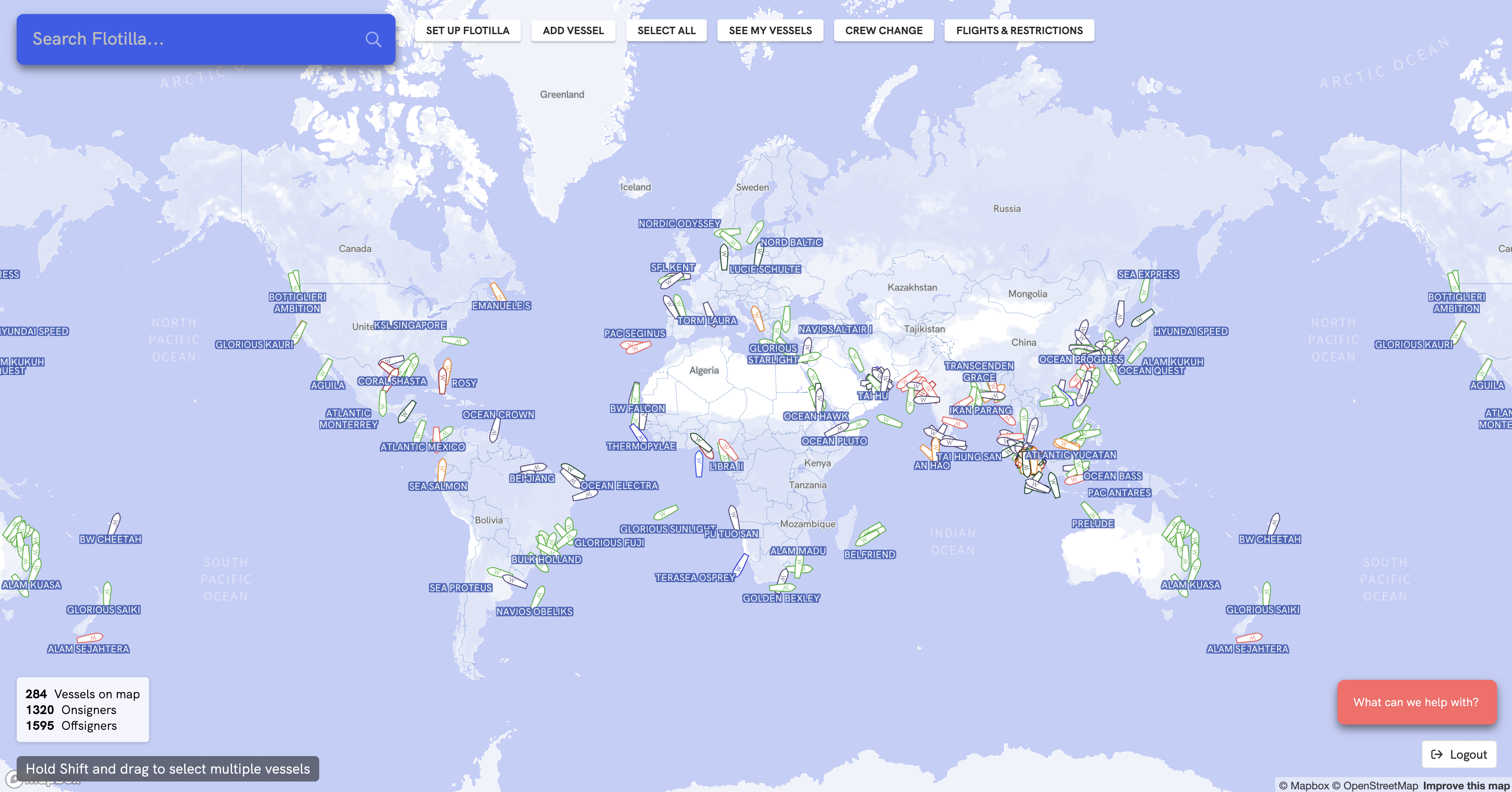
Flotilla, our fleet tracking tool, is going from this:
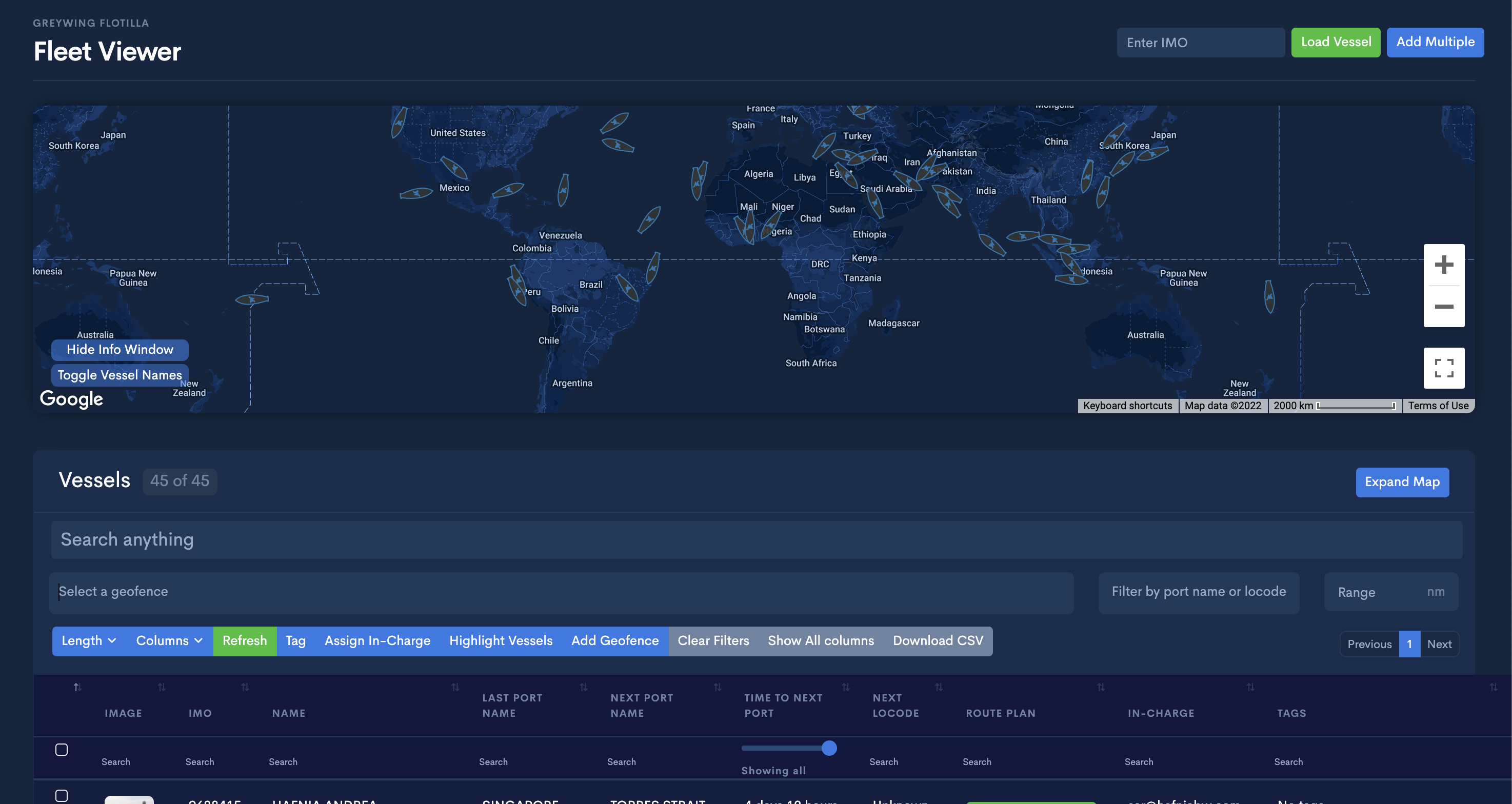
to this:
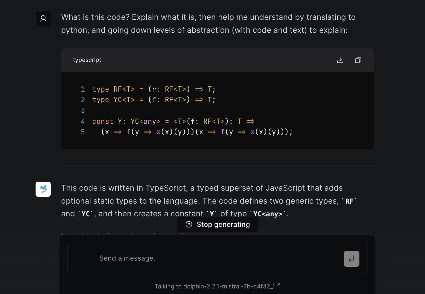
Our crew change intelligence tool CRY4 is being accented by a search tool that looks like this, and can serve all of the information you would find on CRY4:
Imagine what both of these interfaces would look like with six more months of new features and data: our hope is that there would not be much change. Intelligent suggestions and recommended searches can push users in the direction they need to go, while users for whom this is irrelevant can remain blissfully unaware of their existence.
Another alternative is to segment our interface into a much larger number of smaller pages, each of which serves a specific function. We decided against it due to our size and the resources we have available to test and bulletproof such a system.
There are also a number of problems with search-based interfaces I'd be remiss to mention. Discovery (even with good recommendation systems) is a problem. Even with 50 buttons, you can read each one to learn something new. In addition, search bars often straddle the uncanny valley of being human-like enough that users expect more, which makes them seem dumb - a lot like Siri and Alexa.
So this isn't necessarily an argument for search-based interfaces. This is a warning to keep an eye out for what I've come to call "Button Syndrome".
The next time you need to add something to your product, wonder if there are too many buttons, and if your product can understand user intent.
§Update: Counterpoints and Further Discussion
So this post has sparked some discussion online - scroll to the end for comments. This is what I love about the internet, and why I write. Nothing I write is didactic - except for the occassional bug fix. We are informed by the limited lives we live and the limits of our senses, and the biggest question on my mind comes from the fact that I don't know what I don't know. It's the reason why we "rediscover something with recognizing it", as (vb1616) put it.
So here's where I was wrong and what can be added. If you'd rather skip to the comments directly, you can skip this section.
I think there's broad agreement that there is a problem, although a lot of us like the button way of interfaces (thrower123), and hate when the programmer presumes he knows what you want (egypturnash). This is true, and it has definitely frustrated me in the things I use. The primary reason for this would be the increased testing load needed to make it work (soco). This is a considered trade-off we are making at the company. We've crossed the point in our product where delivering the functionality was the hardest part. Getting the user to understand said functionality, and integrating it into their lives and workflows with minimal disruption is now the hardest and most important thing for us. We'll get some things wrong, but we're settled in to iterate and stay close to the users.
The other point I'd make is that these aren't necessarily interfaces meant for me - or for a large part of the technical readership. I would prefer a lot more buttons, or terminals and manpages. Sitting down our users - and my mum for control - we see real problems with large control surfaces. I might write about why I think this is, but my strongest working theory is a difference in how different users approach systems. When I approach an unknown digital interface, my instinct is to run over every element, hover, click, explore. A lot of our older users were trained in a time when computers were expensive and easy to break. Unless you tell them in many words that it's okay, they're unlikely to ever click on something they don't know.
The second broad category is criticism of search-based interfaces. All fair, I mentioned some above myself. Discoverability is a problem for search. Unfortunately for buttons, they eventually become so congested they become icon interfaces, which to me are even less discoverable. Imagine that your user doesn't know what a hamburger menu icon is. Now consider if the ubiquitous share icon on mobile is actually intuitive for a new user. There are many ways to skin this, and search (with the great suggestion from (KennyBlanken) and (ddingus) about linking to a button or menu item) is what we're trying to fix it with. YMMV.
Now we come to problems with the post. First, (Rcou) points out that fighter pilot interfaces may not be the best example - and I agree. Pilots are a captive user base willing to dedicate years of training in life-or-death scenarios to become good at the interfaces they need to use. It's still a striking example of how interfaces have changed, and pilots undergoing information overload - despite years of training - might be a proxy for a less engaged user leaving a confusing tool behind.
The next one is my favorite. (thumasiotes) points out that I jumped context myself when talking about Office without much warning, making for a more disconnected read. This is a beautiful illustration of why this happens, and how we can fix it. As the writer, I understand my thought process as well as a developer understands the functionality they build. So we're both prone to leaps in logic and intuition that we forget doesn't exist for someone starting anew. The best solution is always to test more, to get as many fresh eyes on it as you can. In Don't Make Me Think, Steve Krug talks about watching users like a hawk to know where they lose the thread. It may seem trivial and obvious, but that's only because you have gigabytes of information in your head about this specific thing that they don't. I've reworked it, hopefully it should flow better now.
I'll end with a link to a beautiful quote from (teddyh) here, that (jtsummers) describes as the distinction between '"capable but not overwhelming", "capable and overwhelming", "incapable but not overwhelming", and "incapable but still overwhelming". The first two can both describe advanced systems without dumbification, but the user experience is qualitatively different and can lead to wildly different outcomes when put into use.'

Not a newsletter