Why I still can't stop using Chrome
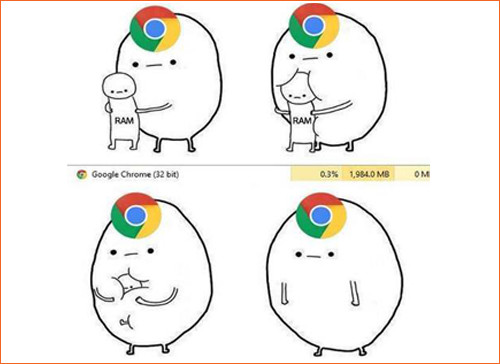
I remember the first time I used Chrome. I started moving my bookmarks and preferences over to it within the hour, and one key reason stands above all the others as to why. It's why I still use it (despite it being objectively bad for battery and RAM on almost every OS I've tested), and it boggles my mind that I've not heard anyone mention it before.
There's no denying that Chrome was fast, and still is, but other browsers have now closed that gap considerably - by copying the engine and adding platform-specific tweaks that Chrome can't necessarily keep up with. However, when I first opened it up on a Pentium D machine with 4 GB of RAM (I was visiting my parents at the time), what struck me is how fast it felt.
Try this on your system: Close all instances of Google Chrome, then open the browser and start typing. I didn't say open the browser, wait for the UI to load, the caret to start blinking at you from the address bar, then start typing. Open the browser - through Spotlight, command line, Cortana (ugh) or Gnome, and just start typing. Press enter if you're done typing before the interface shows up. Chances are your webpage will start loading as soon as the UI shows up. The same goes for opening a new tab.
That's it. When Chrome first launched, it was amazing for a number of reasons - the speed, tab sandboxing, the clean UI (which has now started accumulating crud), the engine - but none were as key to my experience as this one. It's your first point of contact with the software, and one of the most important. It's the first thing I do when I consider switching to a different browser - usually when Chrome has killed my battery and my poor RAM again. I open it up and start typing; I'm always disappointed by the results. When Chrome first launched, Firefox and Safari wouldn't even highlight the address bar when the interface loaded. They do now, yet for some reason Chrome still does it faster, and so I live with 2 GB of RAM remaining.
These days, it's a very small difference (perhaps less than a second), but it's an important one. Have you ever started talking to someone, they told you to wait a second, and you'd already forgotten what you wanted to talk about by the time they looked up? That's what it feels like. Those two seconds, for the first action a user ever takes, are the most important. A second there is often the difference between the speed of thought and dial-up.
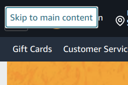
It's also the reason that capturing focus to the right elements is important. It's often completely overlooked in the websites I visit, because it's hard to notice. google.com gets it right - the search box is highlighted as soon as I land on the page - but amazon.com gets it wrong. I have no clear idea where the focus is (it seems to be on a hidden 'Skip To Main Content' button that I didn't know existed), and I need to hunt for the search bar.
Google also gets it wrong once search results are displayed. Have you ever tried to navigate Google's search results with only a keyboard? The first result isn't highlighted, and moving from result to result requires tabbing through every element in between. I'm willing to give them the benefit of the doubt and say there might be reasons there I don't know, but I hope the point is clear. The predictability of my first few seconds with Chrome is why it's a part of my brain now. I've had dreams where I wanted to know something, and I typed Super+C+h+r+Enter+<query> before realizing I wasn't at a computer.
A close second in the same vein is how focus shifts between elements. How many of us consider tabbing order after we've built a form? I don't, even though I know I should. Interface predictability (one small component of which Google is attempting to measure with Cumulative Layout Shift) is incredibly important. Give me predictable interfaces over good ones, if I had to choose. I can learn to make my way through a bad interface, but I can't build muscle memory and habits if they're unpredictable. If your doorknob was unpredictably high from the ground or your cup handles an unpredictable level of solid, you wouldn't be able to walk into your house while scuffling out of your shoes or take a sip while looking elsewhere. Phone manufacturers still don't get (or choose to ignore) that this is the reason we want our hardware buttons to stay, and why one of the most reliable ways to interact with a computer is still the keyboard. The home row of my keyboard behaves predictably no matter what I'm in, and a physical camera button that depresses halfway for focus still trumps tap to focus for me.
It's also my biggest problem with Reactified SPAs. My workflow has, over time, annealed to work with the browser's quirks and mechanisms. When they're highjacked in unpredictable and outright wrong ways, I feel like I'm shoved back a decade trying to use a product. The best example is in page navigation. My standard way of working through a system is to open a bunch of new tabs with the things I want to explore (breadth-first), then look through them in detail as I close any tabs that I realise are irrelevant as I learn more. Every fifth React site I visit (and I'm using React as a stand-in for anything that highjacks the browser), Ctrl+clicking opens up some random page I wasn't looking to load and suddenly the back functionality for the page I'm in is broken.
I'm not going to go as far as to say that this is unacceptable; I know that developers can never test all possible use-cases, and mine is anecdotally bohemian. I'm also not going to point out a problem without offering a solution. I'll stay away from the solution I sometimes feel like shouting into a pillow, and instead offer this:
When you build systems that don't follow the expected behavior in their circumstance, use visual language that hints to the user that you're doing something different. Don't have blue, underlined links when they don't trigger a page change - use buttons instead. Don't end a page with a tall footer, when there's an infinitely loading list right above it.
Dangling by a trivial feature is a great illustration of what it took me over half a decade to learn, and probably what I'll need the next decade to internalise: The point of contact between your product and the user is the most important part. The clever backend and the beautiful end result is secondary - which is painful for me to say, because most of my job is to build clever backends. The first thing your user ever does is the most important. It can be as simple as landing on your page. The second is the second most important. I don't think about those actions often enough. It can be hard, when you're working on feature X three levels deep in the UI, but I'm learning to return regularly to think about it.

Not a newsletter