For the first 15 years of my life, I knew that I loved surprises. It led me to quite a few disappointments, before I heard someone say that we want the surprises we want, and it made sense. Surprises are important, but they are really quite hard to get right. More importantly, too many of them can be exhausting. There is a mental load associated with having your expectations about a moment subverted, and adjusting to the new normal - even if it's much better than what you expected.
The same exhaustion applies to stories. When a story takes an unexpected turn for the first time (especially in the first half), it's often quite welcome. It reminds you that the world is unpredictable, and keeps things interesting. A second time, it needs to earn its place by adding something interesting to the mix. A third or a fourth time, and it often breaks believability. If it feels like lazy writing, it can genuinely turn off your audience.

The simple solution for this is telegraphing, which refers to a prior indicator that something might happen later on. You reduce your chances of something being unexpected if you can let your audience know what kind of thing they're expecting. Much like the shape of the boxes under a Christmas tree will tell you a little bit, telegraphed surprises often go over a lot better.
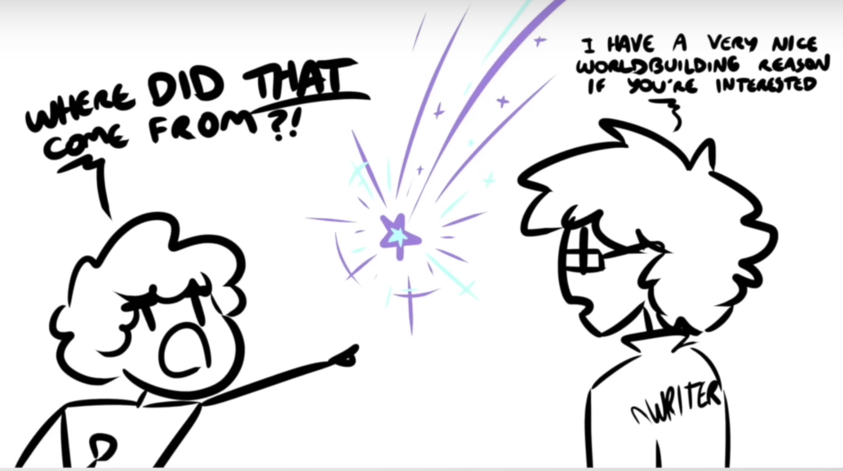
In storytelling, well telegraphed and executed surprises get you Chekhov's Gun. Well telegraphed but left incomplete, you get a Red Herring. Done badly or left out entirely for a plot contrivance, you get a Deus Ex Machina. (If you're interested in a small dive into Deus Ex Machina as a trope, OSP has a good video I'd recommend.)
There is a wonderful scene from the new show Foundation, where the emperor muses that his clones' primary purpose in ruling is to be predictable; to be a stable presence that the galaxy may align itself around its ruler. The same is true for the underlying fabric of a story. The more fundamental an attribute of your characters or your world, the less latitude you have for changing it midway. If you have Game of Thrones-esque world where death is uncertain and fickle, giving your characters unearned plot armor later on becomes a problem. In the reverse, if you have a safe and plot-armored group of characters, killing one of them later on for shock value will lead to problems.
§Telegraph your interfaces
The same can be said about software. The more fundamental (and irreversible) an action, the more you need to telegraph what it does. This has multiple benefits. The obvious one is preventing user confusion. If you've ever clicked on something in an interface and realised you did something horrible, a lack of telegraphing might be to blame. Additionally, good indicators remove or reduce the need for long explainy dialog boxes that no one likes to read. This also applies to chains of actions. If you have a chain - a wizard, a sequence for creating a document, etc - that users are likely to speed through, warn them ahead of time if they have an important choice to make halfway through.
Here's a bad example. Which of these actions are modifiers, which make no content changes, and which modify metadata?
Here's another one. Which of these menu items are completely safe, which are fine, and which one is destructive?
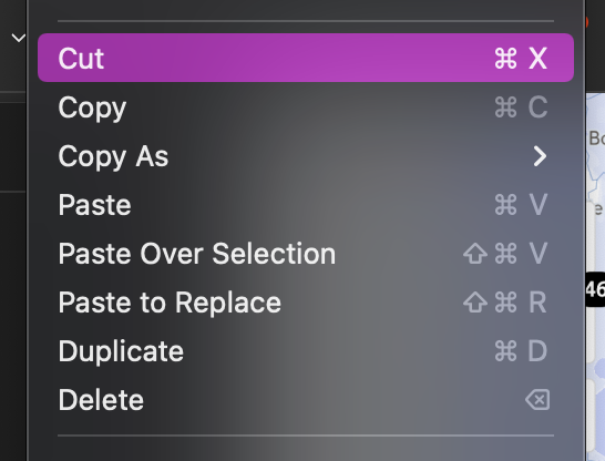
Both of the examples above were the same product.
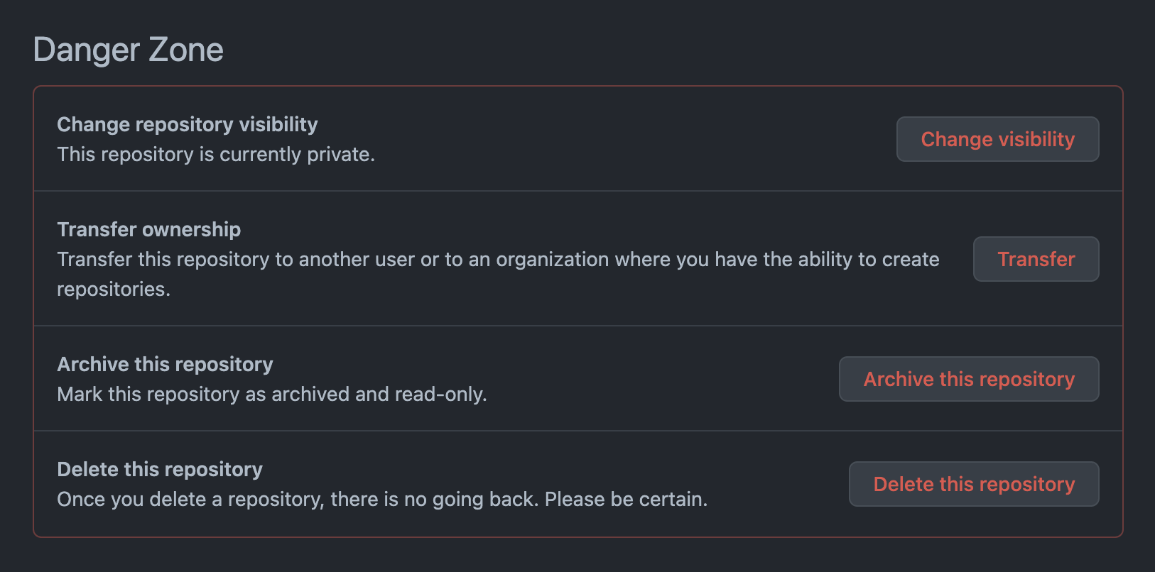
Here are some better ones that all include the same irreversible action. Which one stands out more?


§Some interesting methods
Let's say you agree. How to go about it?
The simplest method - as seen above - is using color. Red being the color of human blood is now universally seen as an indicator for blood. Provided you haven't used it as your primary brand color, or diluted its meaning in your interface, it can serve as an easy reminder that something should be approached with caution. Point of concern: don't use the same red to indicate unread notifications and destructive actions.
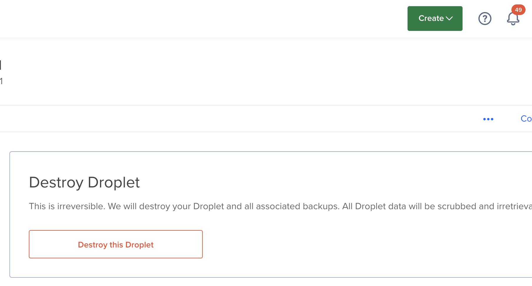
Icons can also be helpful. The skull and crossbones have been warning us on our cigarettes and power lines for some time, and can catch attention and force users to check themselves.
Some interface speed breaks can also be helpful. Directing the user to a new subpage for an action forces them to reassess their surroundings, and remind them that they may not be in Kansas anymore. This can also give you some space to explain yourself, and hope that you are heard.
Context sensitivity is another way, where actions are grouped in ways that make sense. Sometimes these clash with semantic or subject-based grouping (as in the case of the menubar), and it becomes a judgement call to draw the line between making sense and being safe. Maybe it makes sense to put all edit actions together, and all create actions elsewhere - even though two of the edit and one of the create actions are really quite different in how destructive they are.
A really fun but hard to implement method is to indicate what an action does on hover - by either performing the action temporarily (like the Bold/Italics button in good editors), or with a small preview of what it might do. With newer frameworks like Redux (or CRDTs), this might be easier than before, but you'll need a small sandbox to perform the action in, if you want to show a realistic preview of what it will do.
A really really simple bandaid might be to always have informative tooltips - no matter the action. Your users will appreciate the extra bit of information - as I know I have in the past.
If you have no other method (which is really, really rare), use dialog boxes - but be warned that most users are afflicted with dialog box blindness and will proceed to continue entirely on muscle memory.
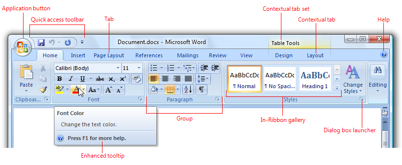
I'm still collecting new ways of telegraphing actions in an interface - a task that is made harder by the pull of novelty when it comes to what we want things to look like. Around the same time that we build comfort in an existing paradigm like Material, Skeumorphic or Windows 95, it starts to feel stale and we start wanting something new. Sometimes we get an Omnibox, but sometimes we get a Ribbon.
Not a newsletter


